Summary of San Antonio Sub Markets for Flipping Houses
The following are graphical representations of the Prezi I previously posted on market segments in San Antonio for flipping houses. These figures reflect the past six months of houses that were flipped. These do not represent each sub-market as a whole. The effects of this will be discussed in relation to the data being compared with each chart.
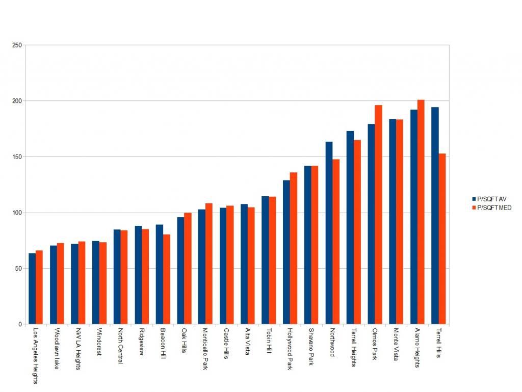
This graph shows how price per square foot fluctuates between areas of San Antonio for flipping. The blue indicates the average $/sqft whereas the red shows the median.
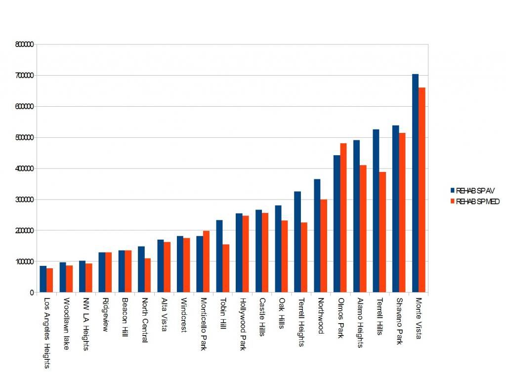
This graph shows the average (blue) and median (red) sales prices of flips in each neighborhood in the city.
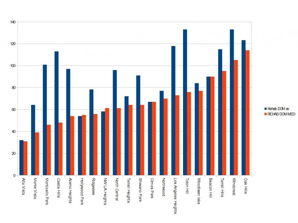
This graph shows Days on Market for flips and increases according to the median (red) DOM for each area.
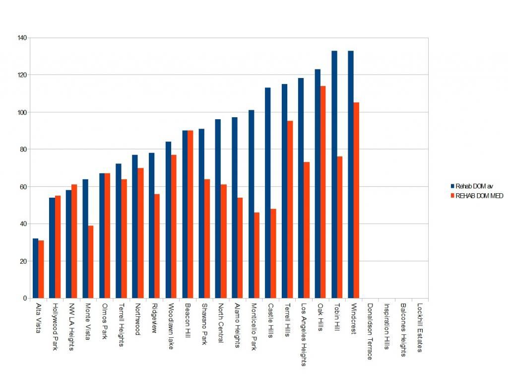
This graph shows Days on Market for flips and increases according to the average (blue) DOM for each area.
Ryan, thank you for this insightful and very valuable analysis. You are one smart guy!
ReplyDeleteThe market stats for San Antonio described very well is excellent. Thanks for sharing
ReplyDeleteThe concept of your blog is very fresh i definitely sure the visitors who visit your will like your content and pointers.
ReplyDeleteI completely agree with the above comment, the internet is with a doubt growing into the most important medium of communication across the globe and its due to sites like this that ideas are spreading so quickly.
ReplyDeleteDear Ryan, thank you for this information on chart about house in Real Estate San Antonio Markets.http:// https://www.youtube.com/watch?v=MiY41ijpzuI
ReplyDeleteHello mate niice post
ReplyDelete